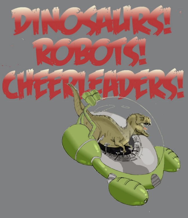
Here's a full colored in version of a panel I've posted before in different stages of completion (pencils, inks, partial colors)
I used this picture to try out different colors on Nikki's uniform. I think this is the unifom color I'm going with.
DH
« | June 2011 | » | ||||
![]() |
||||||
S | M | T | W | T | F | S |
1 | 2 | 3 | 4 | |||
5 | 6 | 7 | 8 | 9 | 10 | 11 |
12 | 13 | 14 | 15 | 16 | 17 | 18 |
19 | 20 | 21 | 22 | 23 | 24 | 25 |
26 | 27 | 28 | 29 | 30 |
Here's a full colored in version of a panel I've posted before in different stages of completion (pencils, inks, partial colors)
I used this picture to try out different colors on Nikki's uniform. I think this is the unifom color I'm going with.
DH
Behold in all her awesome glory: Molly! She's the head cheerleader and she's as tough and fiesty as she is gorgeous. I based this character partially on my wife (she doesn't read my blog so she'll never know) and partially on Starbuck from BattleStar Galactica (I will campaign to have Katie Sackhoff portray her for Dinosaurs! Robots! Cheerleaders! The Movie) I fell in love with this picture as soon as I drew it. I decided to scan the pencils to post on the BLOG! On a whim, I started blocking in colors on the computer right over the pencils to get a feel for how it would look. What resulted is one of the prettiest pictures I ever crapped out:
I really like the look of the blotchy colors over a pencil drawing. I'm not sure if I'll use this style for any actual comic pages, but it sure looks pretty.
DH
Just saw X-Men First Class. Seriously, go see this movie. Afterwards my friends and I were discussing if this is the best comic book movie yet (is it better than Dark Knight? Better than X-Men 2? I say yes) This could be it: The best movie this summer. I'm not sure if Transformers or Captain America can beat it. It had the feel of a Sean Connery James Bond flick, Kevin Bacon as an Evil Mutant and a cameo you won't believe. There were some obscure mutants that they chose for this one, but it all worked. Of course, Magneto and Professor X were spot on, but I also liked how Banshee was portrayed too. Emma Frost was awesome. What really had me sold on this was the early 1960s setting. Anything that might have seemed cheesy could just be seen as contributing to the James bond atmosphere. In a way, that reminded me of one of my all time favorite movies The Incredibles. I really like the idea of doing a superhero movie in a certain time period. When the Fantastic Four movie first came out, I wished they had done it with a 1960s background. That era suits them better than present day. I also wished the Spider Man movies took place in the 60s, with Mary Jane in go-go boots, and Peter Parker hanging out with hippies. Even better, I wish they would do an X-men movie that takes place in the 80s. Picture Kitty with big frizzy 80s hair, or Storm with her mohawk, and soundtrack provided by Journey. I grew up reading Xmen comics in the 80s so I will always see that as their hey day. That was the first super hero comic I read as a kid. Thats why it was so fun seeing these characters again on the big screen portrayed so perfectly. I was blown away.
DH
While I'm coloring in the 7 pages of chapter One, I'm also pencilling in the pages for Chapter Two. (Chapter One comes out JULY 4th, Chapter Two: OCTOBER 31st) I do this in parallel so I can go back and forth and keep a fresh perspective on my drawings. Too many times I think I'm drawing something epic, only to come back to it a few hours later to realize it actually sucks. Here's a peek at the pencils for page two of Chapter Two: The cheerleaders looking up in shock at a Spaceship hovering over their pretty heads. Here's my first attempt:
Looked okay.
Something else I do is sometimes draw two versions of the same page. This way, I can come at it from a different angle without feeling the pressure I would otherwise feel if I had erased one to start over. Here's another version I lliked better and ran with. The lesson I learned is, if in doubt, an upshot of the cheerleaders always wins. Enjoy:
DH
Page One colors are finished. Page Two almost. I posted a colored version of the dinosaur in a spaceship shot. Since then I improved the coloring job. In the older version, the sky is more of a gradient. It looks fancy, but it becomes too much with all the coloring going on with the ship and the city below. Here's a closer to final version. Still figuring things out with coloring, and everything else.
DH
A while back I started working on another version of the cover picture. I just finished inking it in:
I'm not sure if I will like this one better than whats on the front page now. This one is more exciting, and better drawn, but whats on there now its more iconic, and gets the idea across better for a home page.
We'll see how it looks after I color it in, which will be after I color in the rest of chapter one.
DH
Finally finished coloring in page one. Here's panel one, you've seen previously without colors:
Took longer than I thought.
At this point, if I do a page a week, I'll make my self imposed deadline. There is some value to just sticking to your own deadline. Its never going to be perfect, so I would never get anywhere if I didn't at some point just force myself to move on. By the time I get to the coloring, I'm usually working on a drawing I don't like anymore. But its better to move on than be stuck trying to perfect a page.
Then again, it would be nice to just take as long as I needed to make a page that was flawless. For example I picked up a copy of "Nonplayer" by Image Comics. Amazing artwork. Apparently took a year for him to make. Hope the next issue doesn't take as long.
Awesome.
DH
The plan was to get two pages colored this week. Instead, I spent it working on the dinosaur in a space ship pic from page one. I had to get this one right. Even used the computer program to straighten out some of the lines to make it look right. I finally got the colors to the point where i think I want them:
Still working the background colors, but I got the spaceship a nice shiny green color.
Once the colors were right, I used it to create a new T Shirt design:
Now available to purchase at the T Shirt Shop!
DH
So I just saw THOR this weekend and enjoyed the crap out of it. This is a movie that for many reasons should have sucked. It had all the ingredients of an embarrassingly bad turd of a movie, and yet it wasn't. Not only did it not bomb, it was a lot of fun. I could tell the audience was loving it too. In some movies you have to suffer through the slow parts to get to the good stuff. Every minute of THOR was entertaining. Just watching him drink beer or eat breakfast was fun. It all worked because of the characters. Thor, played by that-dude-who-played-Kirk's-father-in-the-new-Star-Trek-movie was what would make or break the film. He nailed it. Just the right balance of corny superhero and believable Viking warrior. Not the greatest epic of our time, but if thats what you're expecting form most movies, you've got the wrong frame of mind. Sometimes you've just got to go with it. Not to spoil too much for those who haven't seen it yet, but clearly Thor and Loki will be key players in next year's Avengers movie. I think Loki will be manipulating things from behind the scenes. First the Hulk will go on a rampage, and the other heroes will join together to stop him. Bruce Banner will join them, and by the end they'll be fighting Loki's army of ogres and trolls from Asgard. Thats my prediction. Marvel's Ultimates and Ultimates 2 should be the playbook for the script. (Pick this up in trade paperback if you haven't by now) If its anything close, it will be an explosion of awesome that will echo through the halls of nerd-dom. But I may have to adjust my expectations a little. Regardless, any movie with Samuel Jackson, Scarlett Johanson, Robet Downey Jr/Iron Man, Thor, Hulk, Hawkeye (look for his cameo in Thor) and Captian America (can't wait to see that next ) has already won in my book.
DH
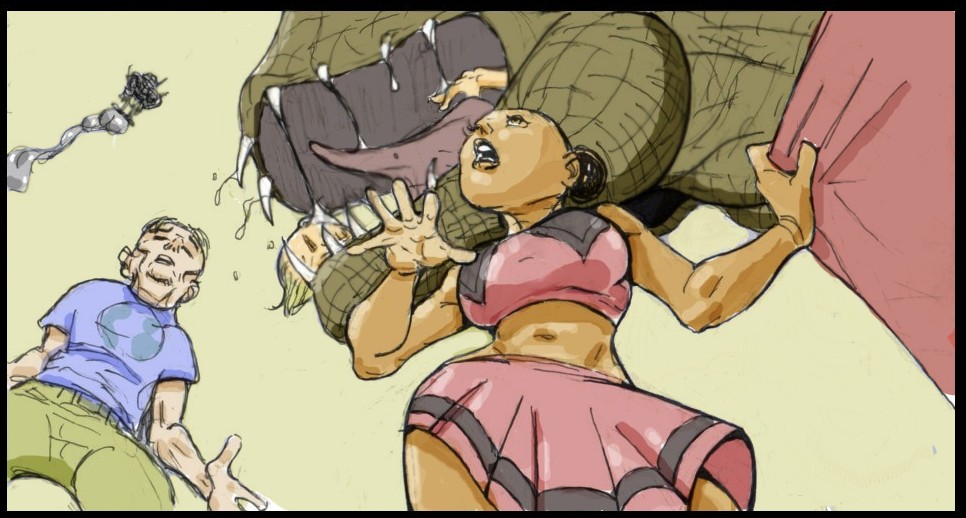
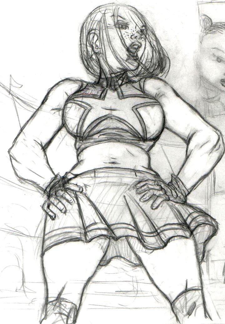
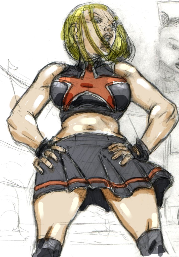
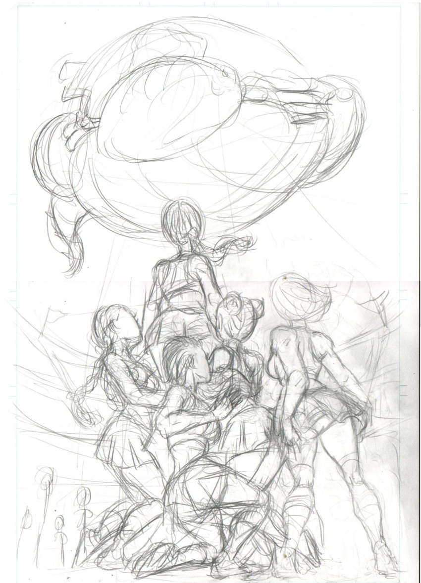
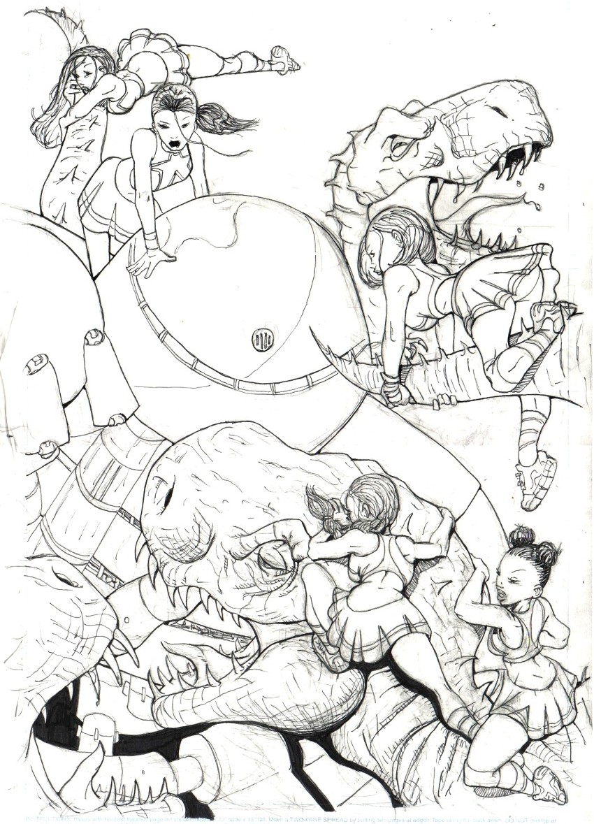
Nearly finished inking in the 7 pages of chapter 1. Now I'm ready to start coloring things in. Before I start, I wanted to play around with the cheeleader uniform colors. Wasn't sure I wanted to use the same colors you see on the cover page. What I did know is I wanted two versions, a lighter version most of them would wear, and a darker version the head cheerleader would wear. This is because darker colors fit Molly, the head cheerleader's personality. Also, she's the blonde one, and I've discovered that blonde girls look hot in darker colors.
Here's a few different uniforms I had Nikki try on for me:
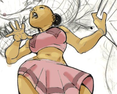
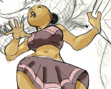
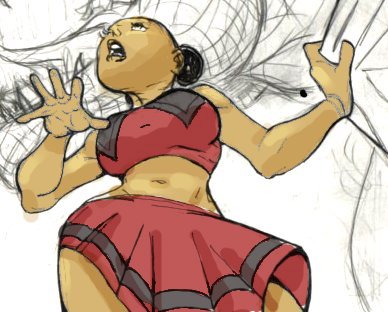
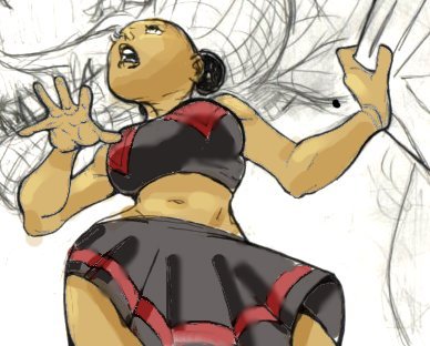
I think I like the last two verions. More vivid. Also, this fits with the red/black colors I use for the website design.
These are just color tests, the final colored pages will look more finished.
Let me know what you think!
DH